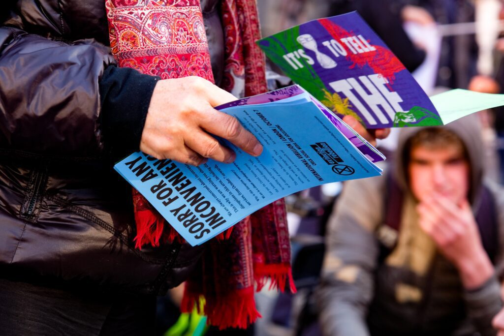
Yes, You Can Have a Text Heavy Flyer Design: Here’s How

Flyer layout design can be difficult to do well, especially with text-heavy projects.
Forcing a lot of information into a limited space is sometimes an unavoidable graphic design issue. The question becomes– how do you design a text-heavy advertisement that still attracts the eye?
People are usually attracted to minimalist, image-heavy designs. You can, however, engage your audience using a large amount of text with a few tips and tricks for great design.
It doesn’t matter if you’re forming an event flyer, a business flyer, or a promo flyer; the following strategies serve as a guide for your text heavy flyer design project.
Text Heavy Flyer Design Guide: How To Design An Eye-Catching Flyer With Lots Of Text
Let’s explore a few essential tips to help you design a text-heavy yet attractive flyer.
It’s pertinent to note that this doesn’t warrant Photoshop or InDesign expertise. Anyone can create a tremendous text-based flyer design with some insight and brainstorming.
Text Layout: Use A Clear Heading Structure
In addition to creating an attention-grabbing headline, it is important to organize your flyer in a way that makes sense to the reader.
Spend a bit of time thinking of the best way to structure your flyer. Information should flow for the reader like a story. If your text isn’t structured well, there is a chance your reader will get lost when reading so much text.
Along with the main header, you should use several clear subheadings to structure the rest of your flyer. The data in the subheadings should be grouped relevantly, using bullet points when possible.
Bullet points are a great structural tool, as they help break up information. A reader who simply skims through your flyer will be able to grab all the essential bits of information.
Design Element: Incorporate Some Sort Of Graphic
Frequently, you may find that there simply isn’t enough space on your flyer for larger infographics or images. Not to fret; try to accommodate a few small graphics and icons on your flyer, instead.
You can create and use little icons as bullet points, as long as they are unique, interesting, and eye-catching. You can also use bigger images or graphics as spacers between your sub-headers.
If you’re designing a business flyer, you should definitely include your company logo in a prominent place.
Color Scheme: Keep It Simple
Your reader will need to focus on a lot of text and, to counter that, it’s safest to stick to a simple color scheme.
Choose a maximum of three colors; two contrasting colors would also work well, with one being a bold color and the other a complementary color.
If, however, you’re designing a business flyer, always incorporate your brand colors in the design layout.
Focus Your Message & Simplify Wherever Possible
When dealing with lots of text, be sure to stick to one main message to avoid losing your reader in your flyer
Once you’ve achieved that, you need to ensure that you’ve streamlined content wherever possible. Get rid of any unnecessary information, and proofread your text for any redundancies.
Keep Some White Space
White space (or negative space) is the empty space between elements of your flyer design. It is the unmarked area between your paragraphs or layouts.
Maintaining white space on your text-laden flyer is necessary to segregate information and achieve a streamlined effect, helping to keep the reader’s attention through the flyer.
Great Flyer Design: More Design Tips For Creating The Perfect Flyer
Here are some further tips to enhance your flyer’s effectiveness:
- Keep up with your brand identity: As mentioned briefly before, if you’re designing a business flyer, you will need to focus on your brand’s color scheme. The logo design and typography should also be in sync with your other digital marketing and print marketing materials.
- Always design for your target audience: Never lose focus of who you’re designing for. Your target audience’s unique needs and desires need to be catered for within your flyer design.
- Include all your contact information, including email and phone number: Give readers all the information they need to learn more, ask questions, RSVP, etc.
- Include social media information: Include your Facebook page, Instagram, and Twitter details for your readers to see your work and reach out to you, if relevant.
- Print a mock-up before printing them all: Printing a mock flyer before bulk-printing can help you save costly errors or printing issues. It can be valuable to get your friend’s and family’s opinions of your mock up, as well.
- Use high-quality paper: Good quality paper speaks volumes about who you are as a brand and what you stand for. It makes people sit up and take notice, and first impressions always count a great deal.
Where Should You Display Your Flyers?
Determining the ideal places to display or hand out your printed flyers is as important as designing the flyer itself.
You need to decipher which areas your target audience frequent, as well as which areas get the most traffic. Public places where people line up in queues are an excellent place to start.
Printing Your Text-Heavy Flyer Designs
Once you have your flyer ready, fonts checked, and are set to have it printed, you need to find the right printer company which can serve all your needs.
At Banana Print, we offer personalized, high-quality printing. We are a 24/7 service, and have a gamut of alternative design templates if you need it. Check out our flyer options here.
