Brochure Design: Complete Guide on How to Make The Best Brochures
Brochures allow you to showcase your business and what you have to offer in more detail than other formats. Also known as a folded leaflet, this style of marketing material offers endless possibilities in terms of design and function. If you’ve never worked with this medium before, find out what makes a good brochure in this guide.
Different Types of Brochures and Their Purposes
There are two main styles of brochures — single fold and tri-fold. A single fold consists of a single sheet folded in half, which provides four panels of content. A tri-fold folded leaflet, on the other hand, separates the branding copy into six panels. However, you have the option to request a custom version with more folds to increase your surface space.
The primary deciding factor between the two main types is the amount of information you need to convey. While a corporate brochure stands as one cohesive document, the paneling helps separate sections of content. If you’re covering multiple items, you may benefit from more paneling. A simpler, single-focused marketing campaign is a better match for a single-fold brochure.
When to Utilize a Brochure
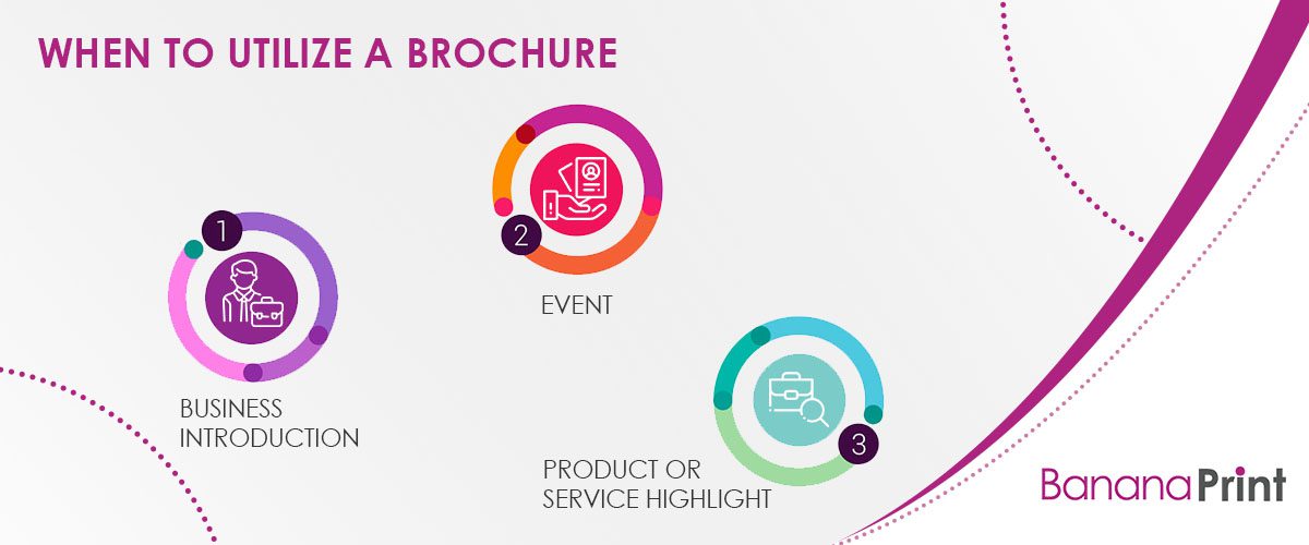
Brochures are one of the most diverse branding materials because they work for a variety of goals. Some of the most common circumstances include:
- Business introduction: Whether launching a business or attracting new clients, a brochure offers plenty of space to introduce your business and its specialties. For this purpose, you can hand out brochures at community and business events as well as send them out in the mail.
- Event: A poster, postcard, or traditional leaflet are excellent ways to announce an event, but a folded leaflet allows you to provide specific details. In most cases, businesses need to utilize multiple formats for special events to drive interest and intrigue customers. Things that fall into the event category include open houses, concerts, and limited time specials.
- Product or service highlight: The size and scope of a brochure make it a fantastic format for outlining products and services. Not only can you highlight your specialties, but you also have the opportunity to explain why they’re so valuable to the reader. This format is a popular choice for restaurant menus.
These three categories cover a wide range of possibilities. The main connection between each is they all offer some level of detail far exceeding that of a business card or poster.
3 Factors to Consider When Designing a Brochure
Before diving into the specifics of what makes a high-quality company brochure, there are a few factors you need to consider. Each of these points is specific to your business and marketing campaign, so it’s important that you evaluate your needs to ensure a quality design.
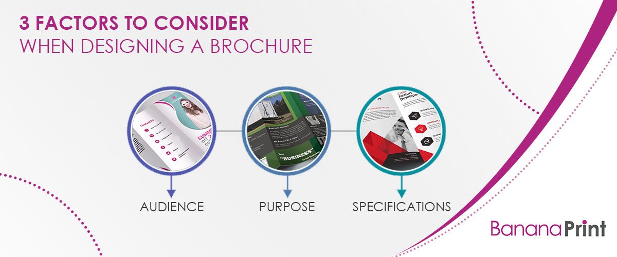
1. Target Audience
The audience is the absolute most important factor when creating marketing materials. Most companies are trying to reach multiple demographics, but each persona is accompanied with its own needs and preferences. As a result, you need to consider what demographic you’re targeting with your brochures. Once you’ve figured that out, consider that group’s specific needs in terms of content and design features.
2. Purpose
Every brochure needs a purpose. Before you start choosing a layout and graphics, determine what your business is trying to accomplish with the format. After you’ve nailed down the topic, you can begin curating content that matches.
3. Specifications
Select the brochure specifications before you begin designing. Skipping this step may cause issues later when attempting to transfer your design to the layout. As a result, you need to choose the layout style (number of folds), size, and paper type.
Not only are there are a variety of brochure styles, but there are also material differences. The three most common paper types are 170 gsm silk, 350gsm silk, and 120gsm recycled. The material you choose should match the goal and audience of your brochure.
Professional Brochure Design Examples
To understand what makes a good brochure, it’s helpful to have visual representations. Here are some expert tips to help you along through the design process — with visual examples and templates — to consider when creating your own folded brochure design.
Combination of Various Visual Elements
There are multiple design components of a brochure. Text creates alluring copy that entices your audience, and easy-to-follow graphics highlight important information without jumbling up the page. Combining all of these visuals creates an aesthetically pleasing and digestible brochure.
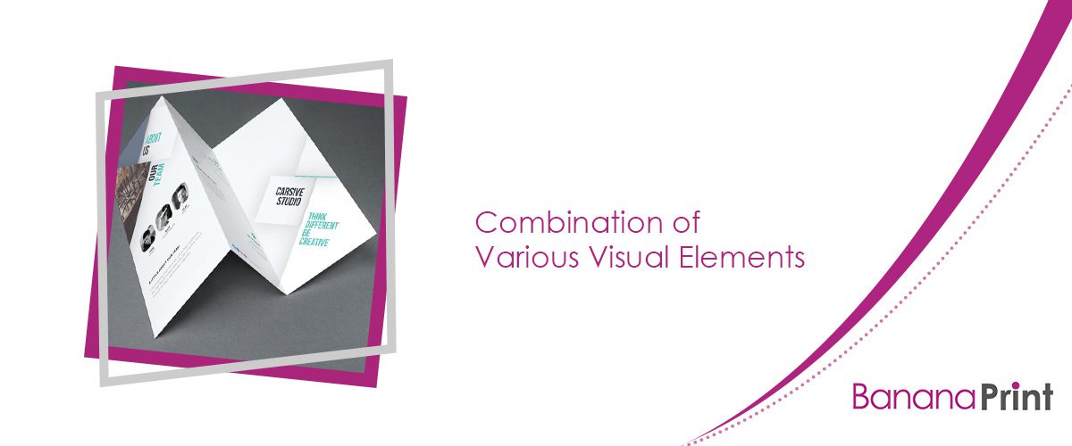
Download the free brochure template design here.
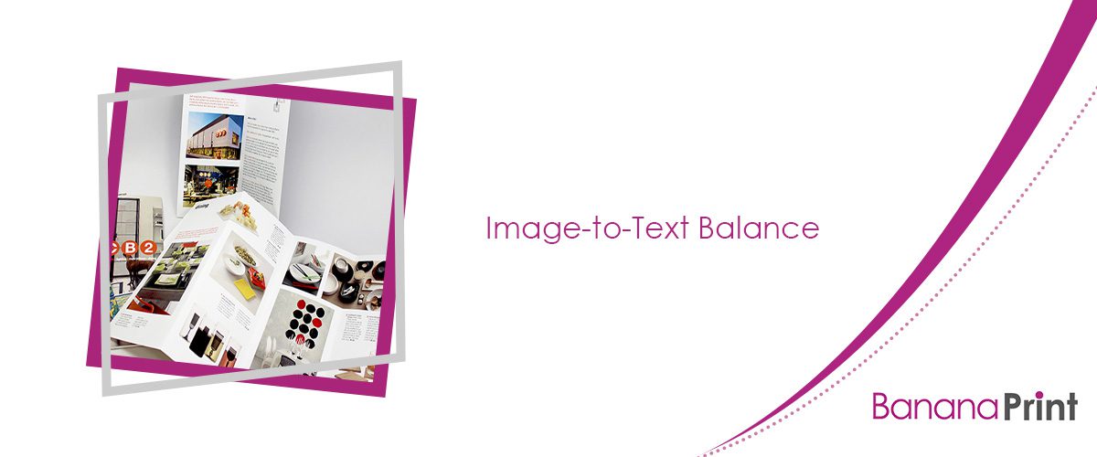
Image-to-Text Balance
Images and graphics are the ideal choices for breaking up information. Heavy blocks of text are hard to read, so separate details with imagery. They help serve as visual transitions across the page, which guides the reader’s eyes from point to point.
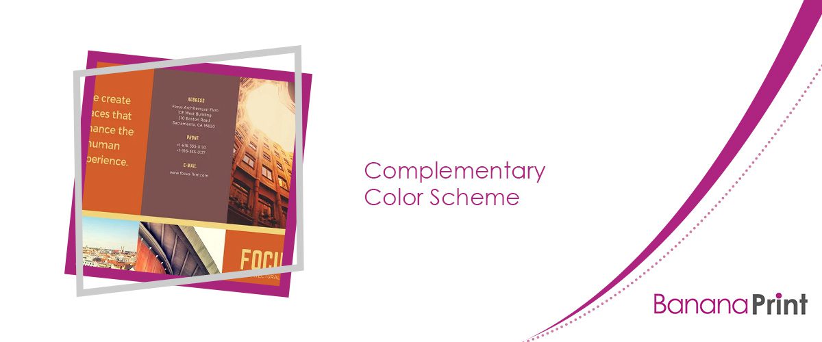
Complementary Color Scheme
If you want to utilize multiple colors, it’s important all the selected shades work together instead of clashing. For example, the muted shades of orange, yellow, and brown in the brochure above all offer the same undertone. As a result, the colors complement one another, which creates a highly pleasing visual finish.
Download this template here.
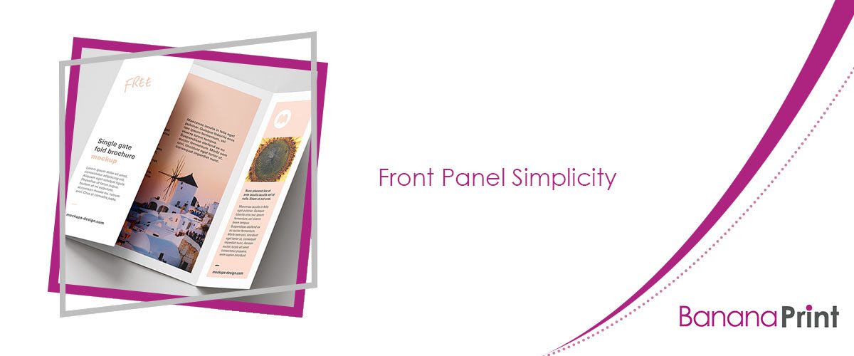
Front Panel Simplicity
It’s tempting to jump right into branding information, but try to keep the front panel of your brochure simple. The front panel serves as the reader’s introduction, so you want to ease them into the rest of the content. Keep text and visual elements minimal while maintaining a substantial amount of white space if possible.
Download this free design here.
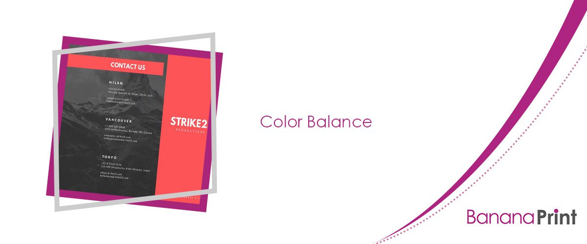
Color Balance
Color balance is incredibly valuable when creating marketing materials. Red is one of the most eye-catching colors, but it can also visually overwhelm the viewer. In such situations, the text is easily lost. However, the designer of the example above balanced the striking red base with a monochromatic image. The artist also made an excellent choice with font color, as the white and muted maroon text are gentle on the eyes. Such a contrast creates a perfect visual balance.
Download this template here.
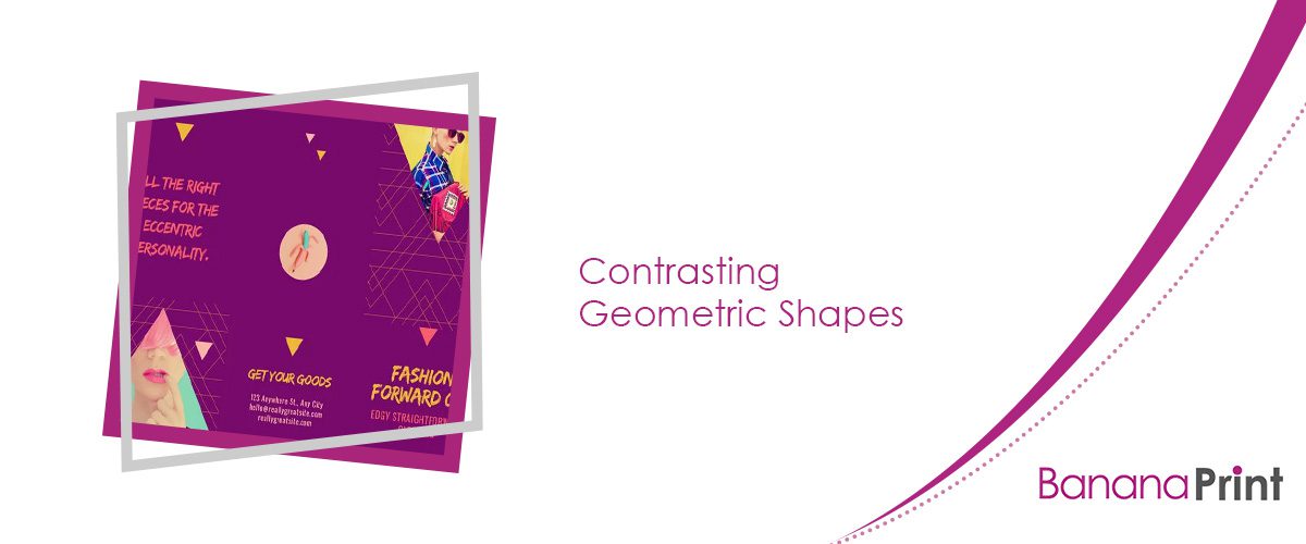
Contrasting Geometric Shapes
If you don’t have any real art or graphic design experience, consider using geometric shapes. In this example, the colored triangles and images visually contrast against the rectangular shape of the brochure. This arrangement catches the reader’s attention without taking away from the information provided.
Download this template here.
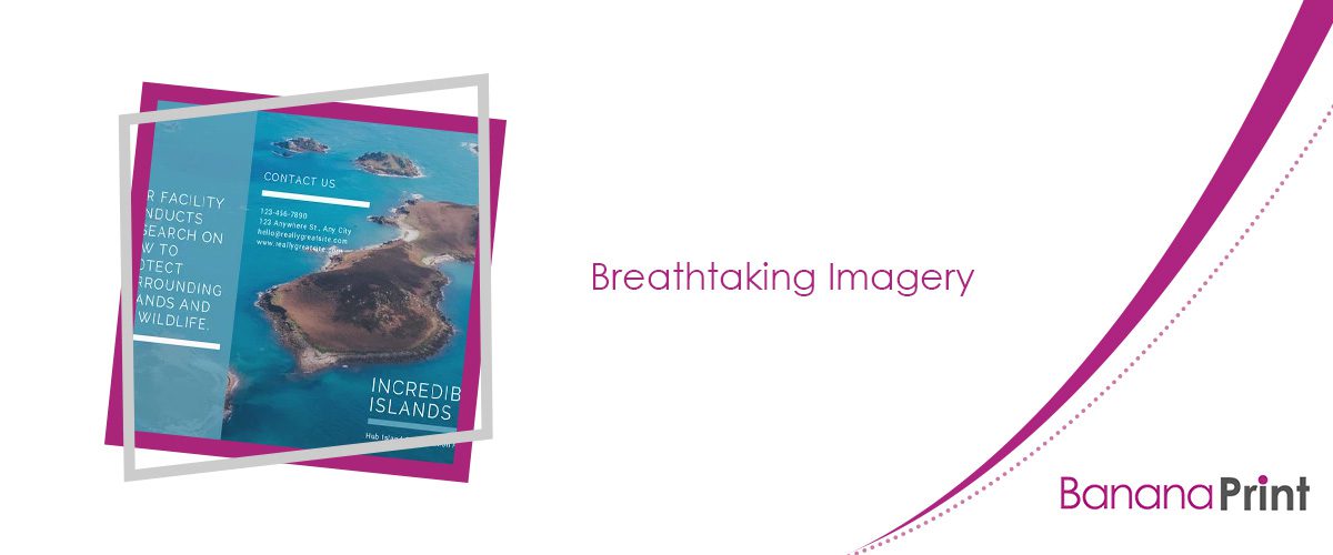
Breathtaking Imagery
Not every brochure needs photography — many industries and subjects are better suited to digitally created graphics and artwork. However, if you have the opportunity to use photos, make sure they’re high-definition images. You may even want to utilize the picture as your brochure’s background, like the example above. If you opt for this arrangement, keep your text minimal and avoid using other images or graphics.
Download this template here.
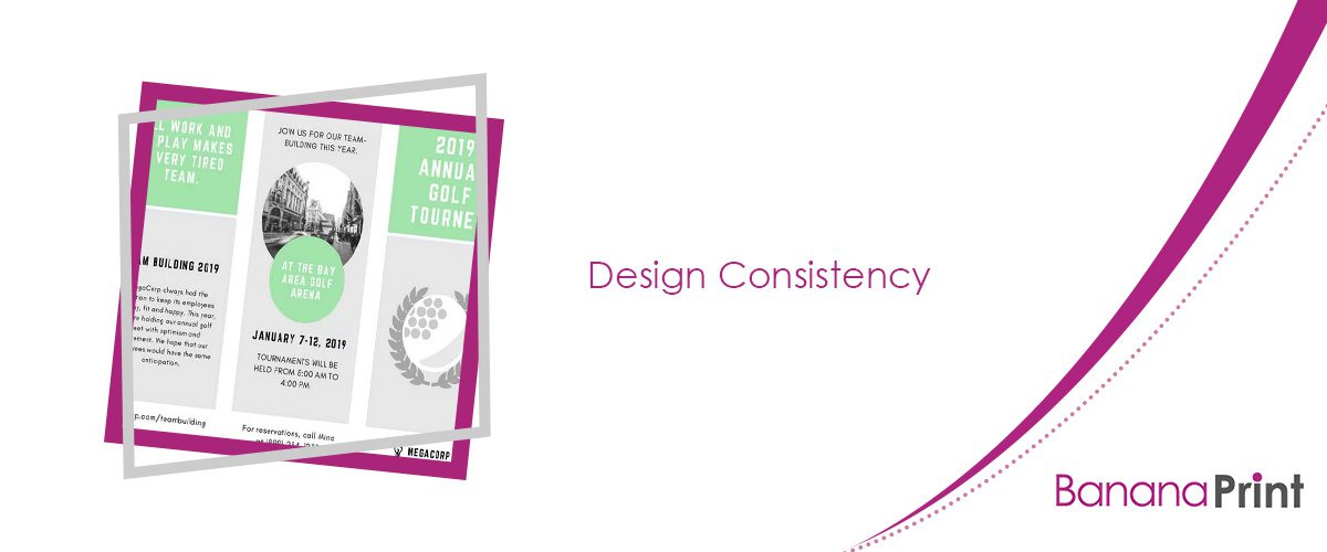
Design Consistency
Consistency is a key component of what makes a good brochure. The broken layout and quantity of detail included in this style of marketing material can easily create confusion for recipients. However, maintaining the same design style, color scheme, and font choices throughout the brochure brings all the panels and sections together into one neat, cohesive document.
Download this template here.
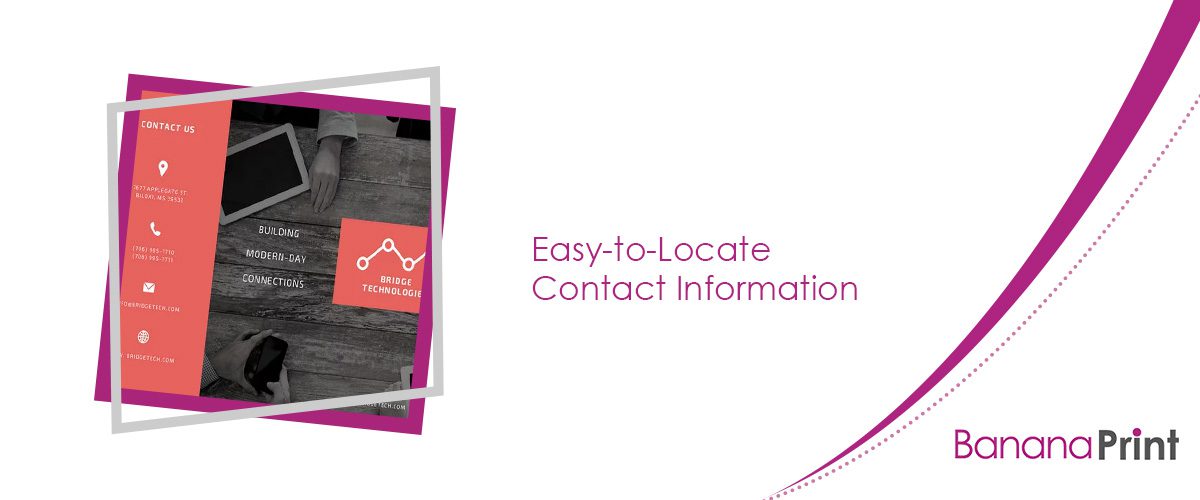
Easy-to-Locate Contact Information
After impressing clients with your design, make sure they know how to get in touch with your business. Include valuable details, such as:
- Phone number
- Physical location
- Website
In the example above, the designer utilized easily identifiable icons with their associated contact information.
Download this template here.
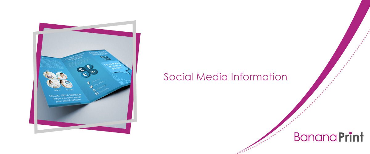
Social Media Information
Social media is a vital component of modern marketing, so it’s only natural you include this information in your brochure. However, only highlight social platforms your company actively uses. Otherwise, you could miss out on possible leads by missing new connections.
You also have the opportunity to take this a step further by utilizing hashtags. Create a brand- or campaign-specific hashtag, and utilize it in your brochure as a call-to-action. This marketing concept works incredibly well for companies that offer physical products because clients can post images of the merchandise with the correlating hashtag. Incorporating hashtags into your branding essentially results in free advertising.
Download this template here.
Design a Stunning Brochure With Banana Print
Now that you know what makes a great custom brochure, it’s time to get started on your own! At Banana Print, we make the whole brochure printing process easy. Choose from a range of template options and customize your product, or upload your own design. Once you order, your delivery is sent out quickly thanks to our 24-hour turnaround printing priority.
Depending on the design project you’re working on, we also offer multiple other top-quality printing items. Some of our most popular products include:
- Business cards
- Leaflets and flyers
- Stickers and labels
- Compliment slips
- Letterheads
- Folded leaflets
- Postcards
Begin creating your brochure today or order our sample pack to view your options in person!
