How to Design a Label: 8 Unique Tips for Novices
Sometimes, the quality of a product’s label will be enough to sell that product.
On a label, the combination of impressive graphic design and useful information is often irresistible to a customer.
In other words, a product’s label can be its own kind of advertising.
It speaks to your business, your product, and the high quality of both. Taking the time to choose the right kind of label and putting thought and care into its design, is therefore essential.
If your business is small and you don’t have the budget for a designer, or if you need to save money, you can design and order your own labels.
So, how do you design a label to make sure you get an amazing finished label or sticker?
First, figure out the type of label you need. Then, follow our easy design tips to make it look professional.
Types of Labels: What Are Your Options?
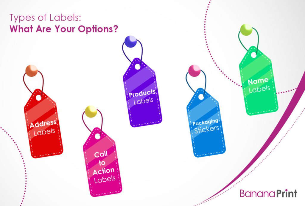
Before you start figuring out how to design a label, you should first figure out what type you need:
- Address Labels
- Call-to-Action Labels
- Product Labels
- Packaging Stickers
- Name Labels
1. Address Labels
Designing your own address labels for your brand makes sending out company-related correspondence easier. Include your logo on the label so when you stick it on an envelope or package, it’s instantly branded for a professional look.
2. Call-to-Action Labels
Call-to-action labels are simple stickers you can place on a product to call your customer to action. These can be simple or elaborate, but most often will have an action phrase. For example, call-to-action labels that say “Touch me!” “Smell me!” or “Look closer!” invite your customer to examine your product and experience the benefits firsthand.
3. Product Labels
Product labels are perhaps the most common type of labels with which you’re familiar. These labels are on almost every product you can buy and describe that product, its benefits, or its ingredients, and include branding.
The right product labeling can help demystify a product, clearly communicate its benefits to the customer, and make it look enticing or appealing.
4. Packaging Stickers
For shipping your products, packaging stickers for boxes and envelopes can take the customer experience one step further. Add a sticker with your logo on it to a box, or add one as an envelope seal, and it instantly elevates the entire package.
5. Name Labels
Whether your team is attending an event or you just need name tags for your front-facing employees, customizing name labels is another great way to make a good impression and stay on-brand.
8 Tips for Designing a Professional-Looking Label
Designing labels for product packaging is a big deal. The label will directly affect how your product is perceived and will influence buying decisions. However, as you’ll soon see, it’s not a good idea to get too critical when you’re trying to figure out how to design a label.
Instead, follow these basic tips, have a little fun with it, and you’ll get a handle on the winning formula for professional, snazzy-looking labels.
1. Use the Best Possible Tools
Before you can design a beautiful logo or online label, you need to have the right tools for the job. Luckily, there are a few different options that will yield great results, whether you’re working in a small business setting or out of your home office.
Consider using one of these design tools:
- Adobe Suite: This software includes a variety of design programs (including Photoshop, Illustrator, and InDesign) that allow you to create and edit complex graphic design products, like product labels.
- Microsoft Word: This software has easy-to-use label formatting templates, so designers can configure and print many labels on one single page.
- Canava: This online software has a wide range of free templates you can use and edit to create your perfect label, making it a great option for entry-level designers.
2. Include the Most Important Information
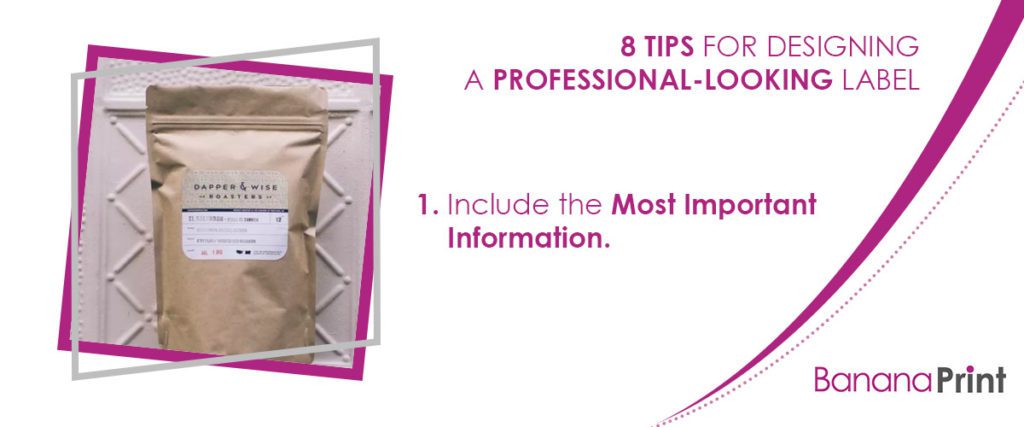
When designing your label, you have to make sure key information is included without overwhelming the label with text.
With too much text, your label starts to look cluttered and confusing. This is why you should outline exactly what you need to include to help the customer make sense of the product and desire it – no more, no less.
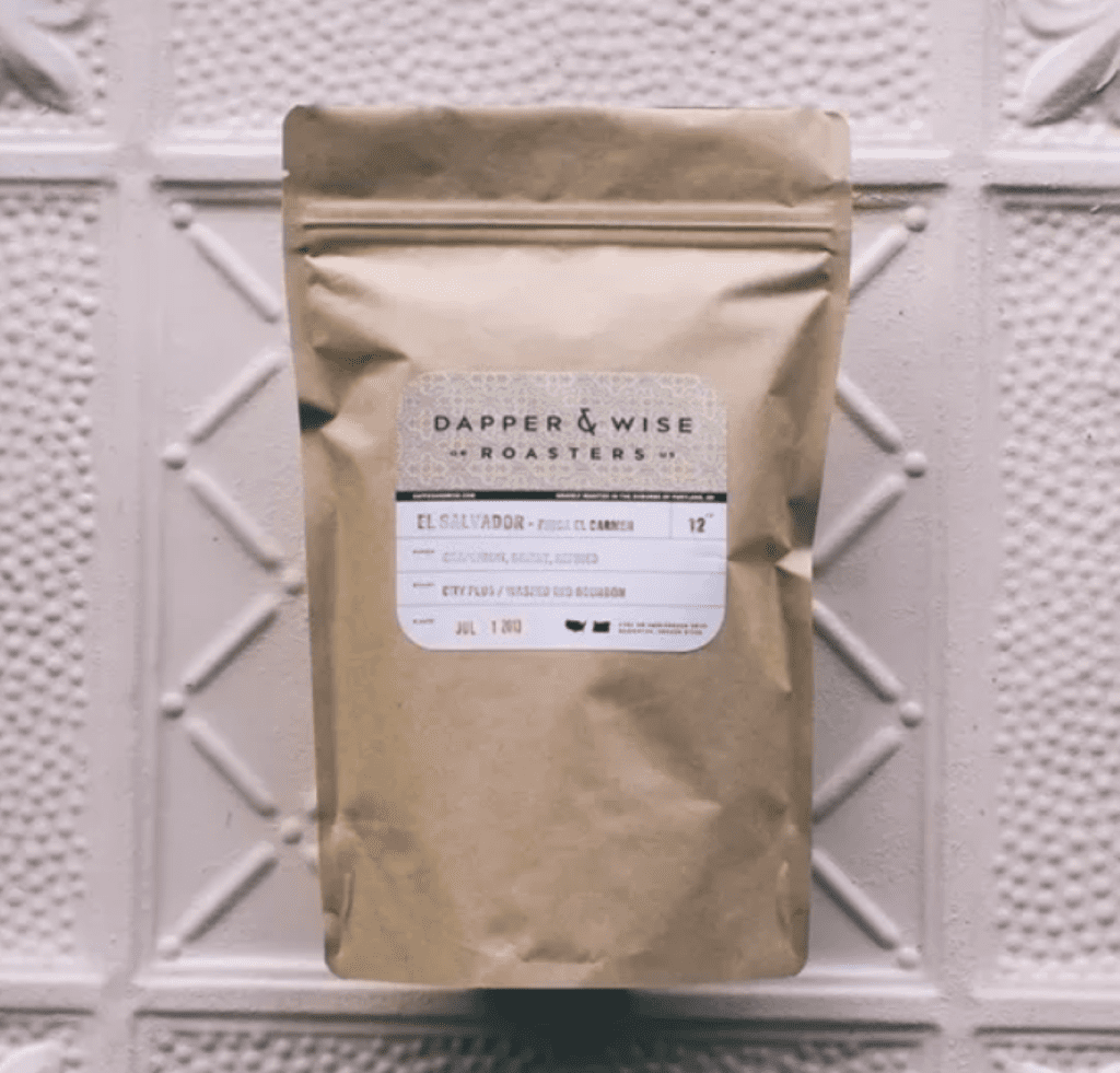
For instance, on the coffee label above, the designer has made sure to include important buying information (the coffee bean origins and the type of roast) but has left plenty of space on the label. This gives the brand name and logo a chance to stand out.
3. Think About the Product Packaging & Containers
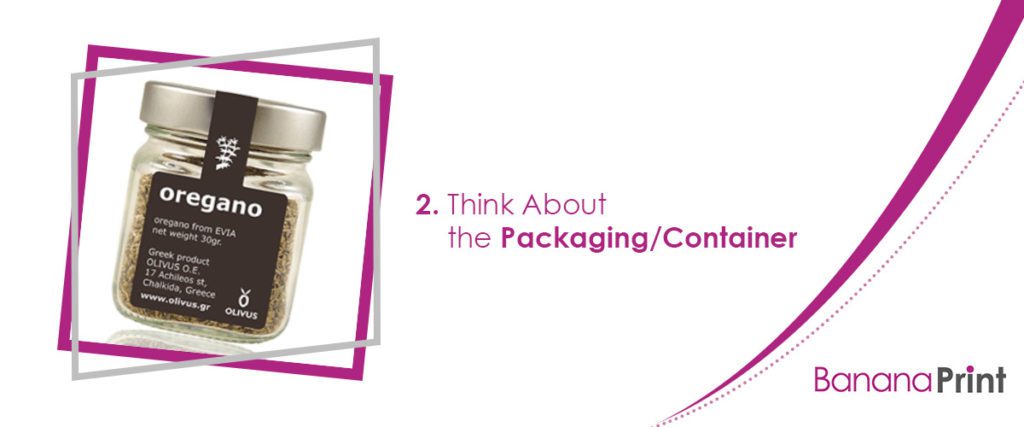
The size, shape, and type of packaging/container for your product will definitely determine your label design, too.
For instance, a small spice jar needs a much smaller label. It has to look good and stand out on that tiny surface, yet you can’t put too much information on it or it will be hard to read.
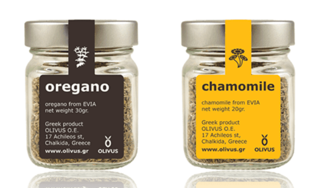
Every product has its own unique packaging (a jar of ketchup will require a very different label than a package of cookies or a pair of headphones). So, when you are designing a product label, it is critically important to keep the product packaging at the top of your mind.
After all, if the label is too big or too small for the container, it won’t catch the customer’s eye!
Consider the product’s shape and size, as well as the label’s location on the packaging, before you begin to work with any other design elements. This will give you clear parameters in which you have to work, which will determine the font and image sizes you need to use.
4. Use a Consistent Brand Logo
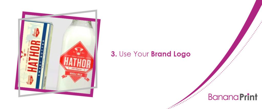
When designing your label, don’t forget to add your logo or branding.
Your product label needs to accomplish two main tasks: it must tell your customer what is inside the packaging, and it must advertise your company. Accomplishing the former is simple enough (just use clear, effective copy on your label) but the latter requires you to use very consistent branding.
How can you make sure your label reflects your brand? By incorporating your logo! Every one of your company printables should bear your logo somewhere, and your product labels are no exception.
Make sure your logo (or a simplified version, if your logo is too detailed for a small label) is prominently placed in your design.
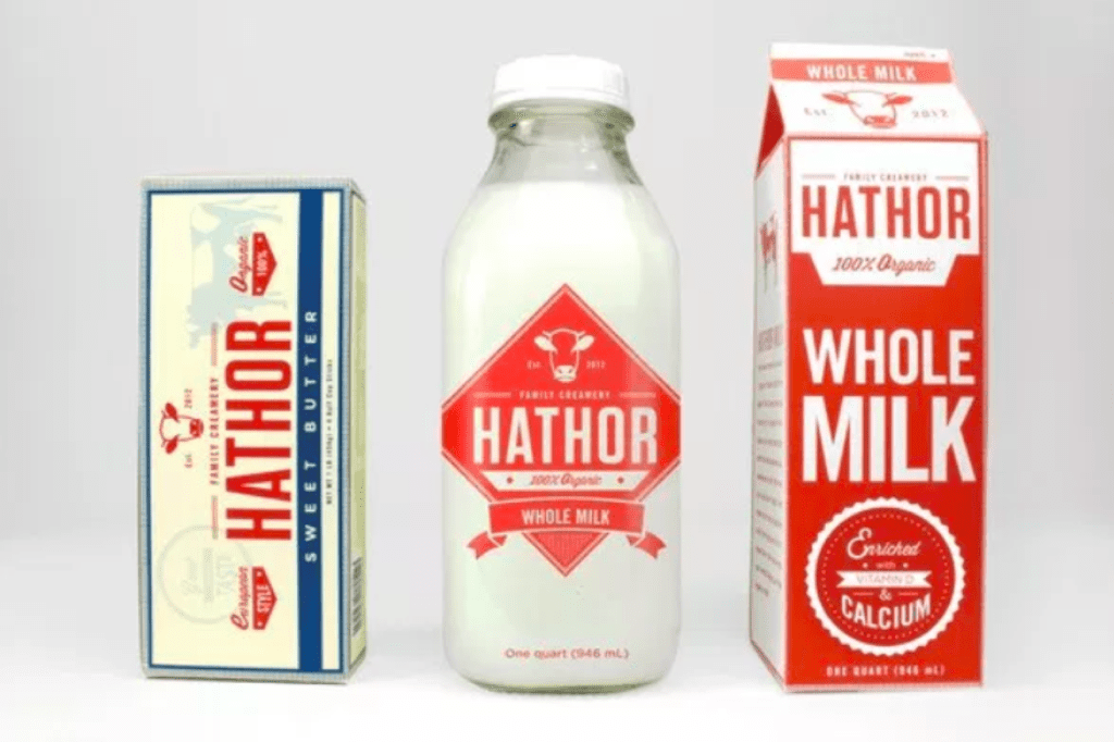
In the above example from Ucreative, the packaging and product may change, but the brand name remains a consistent design element. It looks the same on every package, but it still complements each one.
5. Make It Clear and Readable
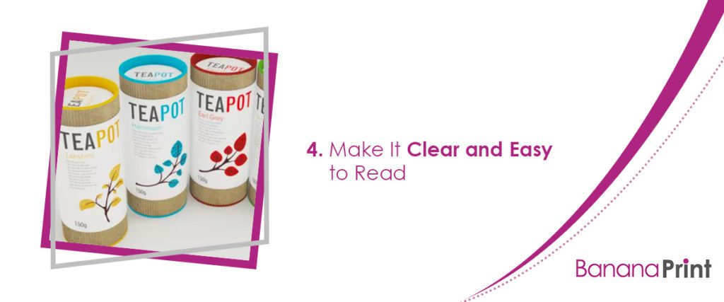
Even the most beautiful label in the world won’t be effective if your customers can’t read it. Readability is arguably the most important element of any graphic design project, from product labels and name tags to company flyers and banners.
Of course, it’s fine if some aspects of your label (the fine print, for example) are only truly legible up close, but your company name and product name must be seen even from across the room. Remember to take a few steps back throughout the design process and see how your label looks from afar.
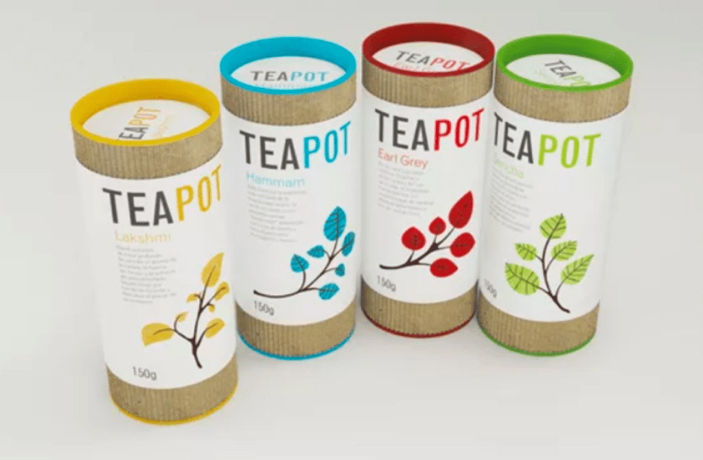
This tip is important if you need your product to stand out on store shelves. A label that’s readable from far away will shout at customers and draw them in.
6. Use a Smart Combination of Fonts
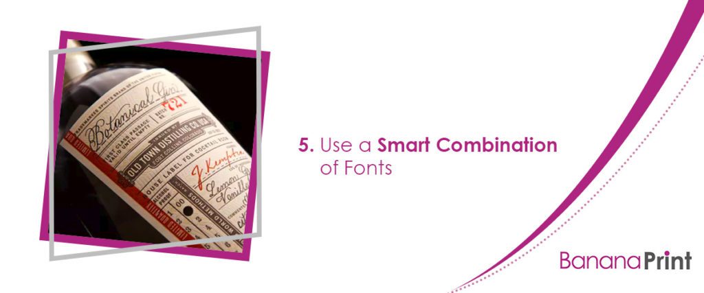
Every label designer knows how important it is to use contrast in your graphic design projects. Contrasting colors or fonts adds dimension to your overall design, which grabs the viewer’s attention and entices them to pick up the product.
Throughout the design process, play around with different font pairings (stick to two or three fonts, no more). Consider fonts of different thickness, or even different styles; for example, ornate script-style fonts always look great alongside bold, modern, sans serif options.
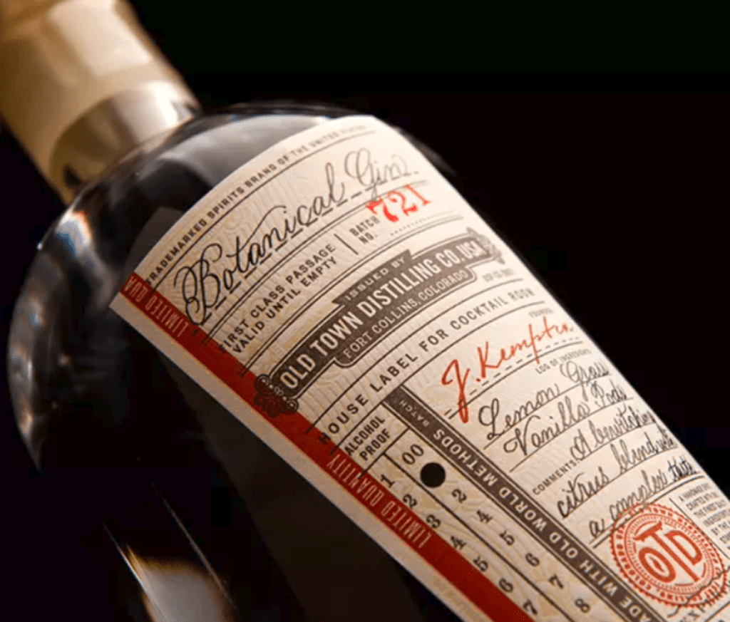
For a similar look, try using two main fonts on your product label. Pick one that’s more elegant and one that’s more modern. Or, pair a cursive font with a bold, all-caps font. Use the difference in fonts to make your label easy to read and understand.
For instance, in the gin label example, the all-caps font is used for the brand name, batch number, and other practical information. The cursive font, meanwhile, is used exclusively to describe the flavors of the wine and the ingredients.
7. Leave Enough White Space
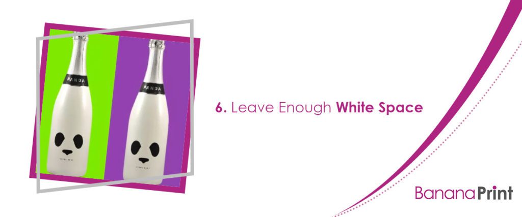
The term “white space” refers to the empty space between different elements on a page, business card, or label. This is particularly important in graphic design, as it keeps your design from becoming too cluttered for the eye to focus on any one element.
Make sure your label has sufficient white space around each design element: your logo, product name, images, and any copy should all have enough space around them that your customers can focus on one aspect at a time.
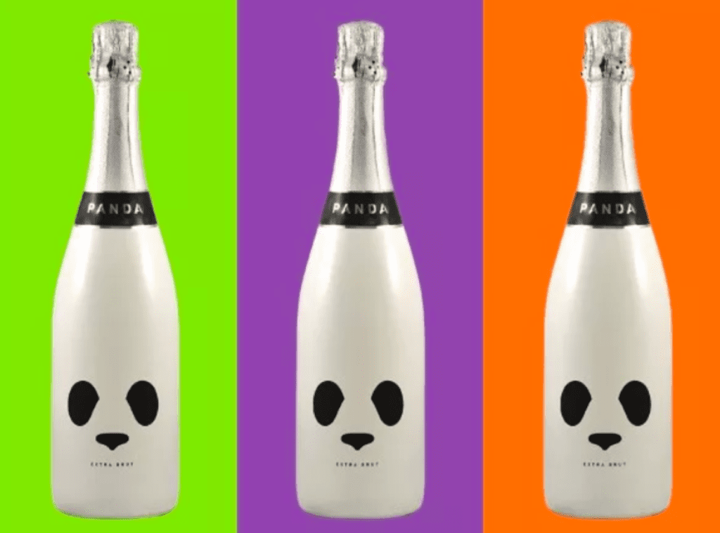
According to Notes on Design, this helps separate important information and creates visual interest.
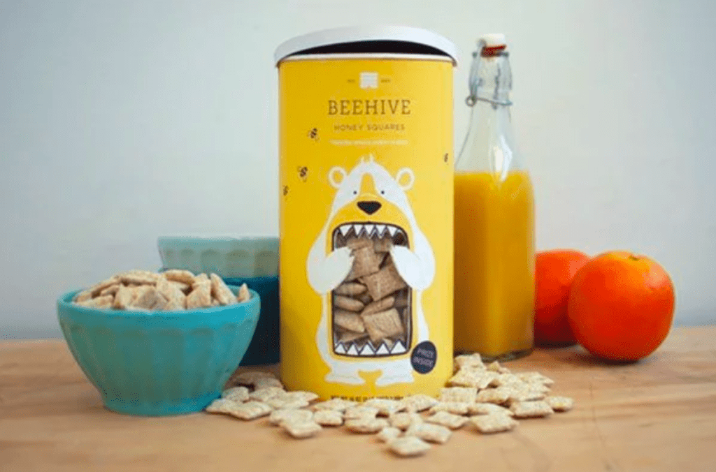
In the above example, the white space is used in a particularly clever way to create the face of a panda.
8. Add at Least One Decorative Element
Labels should first and foremost communicate information about the products they are on. However, that doesn’t mean they shouldn’t be attractive — in fact, they absolutely should be!
Every product label should have at least one decorative design element to give it some artistic flair. This can be a photo of the product in use, an illustration or decorative pattern, or even copy in an attractive color.
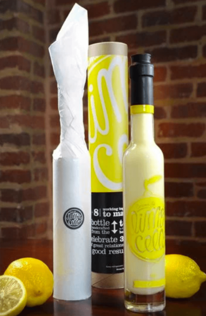
For example, choose an accent color that matches your branding, or add an illustrative element that speaks to what the product does. For a good example, look at the above example of the bottle of limoncello from Crema de Limoncello – the bright, lemon yellow color is the main accent and speaks to the product ingredients.
9. Be Playful
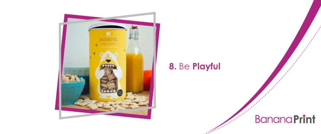
It’s easy to take the question of how to design a label too seriously. Instead, try to have fun with it. Inject some playfulness or personality into your label and you might just come up with something that sells itself.
Think back to the products you remember most fondly from your youth. What did their labels look like? Most likely, they involved drawings of cute characters and playful illustrations that grabbed your eye from across the store aisle.
There’s a reason little you was drawn to these product labels: they’re fun!
Customers are often drawn to products and packaging that have a little personality, so don’t take the process of designing a label too seriously. Sometimes, a cute illustration or clever pun in your copy can be the thing that earns you a purchase.
How to Design a Label: Use Your Creativity
You don’t need a team of professional designers to create the perfect product label. With the right tools, a few graphic design principles, and a lot of personality and creativity, even amateur designers can create labels that are just as awesome as the pros!
If you’re ready to start designing, consider checking out the label templates available at Banana Print one short paragraph for the conclusion. These design templates make it easier than ever to create and print something truly great for your business.
