Makeup Artist Business Cards: Design Guide + 12 Business Card Examples and Links to FREE Templates
Makeup artistry may be one of the more unsung industries. It’s hard to imagine why, given that everyone from models to news anchors must use makeup to look their best.
For seasoned professionals as well as those trying to break out into the business, a few things are essential: Skill, creativity, and connectability. The last one can in part be achieved through a good business card.
But this is 2017. Aren’t paper business cards going the way of brick-and-mortar stores, printed books, and calling (as opposed to tapping) for takeout?
While technological advances have in some ways lessened the dominion paper cards, they have not lessened their usefulness nor their necessity. Indeed, a smart paper card just might be the thing to help you stand out.
In this article, we’ll look at why business cards are important, the components of a creative one, and examples of the best ones that you’ll want to emulate.
 Why Professional Makeup Artist Business Cards are So Important
Traditionally, business cards were streamlined, a bit boring, and carried only the most professionally necessary information. They also tended to be handed out either at industry-related functions like conventions, or else in business-specific everyday situations.
They were important because besides giving the obviously important contact information, they allowed the potential client to make a direct and physical contact with the businessperson, which allowed the contact information to have a more direct connection and be more memorable.
In our day, business cards can carry the same usefulness. They still provide a sense of connection, they can have great mileage (a satisfied client has a card they can hand directly to a friend), they look professional, and perhaps most usefully, they aren’t subject to the potential glitches and issues that plague online outlets.
More specifically, a makeup artist’s bread and butter is a commitment to beauty and creativity. Who is going to pay you to do their makeup if they have no confidence in your knowledge of color schemes, your understanding of facial contours, your sense of personality? A creative business card can communicate just enough of these ideas if it is beautiful and attractive. This will also make it memorable, and help you stand out in cases where someone might be looking at multiple potential artists (think for weddings or for freelance work in the entertainment industry).
With many online designers and printers, business cards also couldn’t be cheaper to design and print.
Even in a day when you can text someone a contact card from your iPhone, a well-designed paper card can be effective and dynamic in ways pixels can’t touch.
What Goes into a Creative Business Card?
Remember that a business card ought to showcase your business—your particular area of expertise and qualification. The more creative and artsy your business is, the more helpful a whimsical and interesting card can be.
This means you will want to communicate the ethos and mission of your job while also capturing something of your passion for it, as well as your unique contributions, skills, or abilities.
As already alluded to above, business cards are a marketing workhorse. To maximize that power, it needs to be attention-getting, creative, inviting, and inspire the potential client to learn more about your business and try out what you have to offer. Some of the ways you can do this are as follows.
- Niche is king. This means the kind of business card you design should be governed by the field in which you work. For example, if you run a financial planning firm, a playful card with loopy script and lots of flowers won’t be fitting. But if you run a makeup business, the serious kind of card a financial planner would use would be totally inappropriate. People will only use your business if you’re providing them with a good or service they want and can have confidence in—and the kind of people who want makeup artistry are not the kind of people interested in high-end financial planning, at least not at the same time. Be marketable to the audience you wish to reach—which means projecting the right image.
- All eyes on the logo. If you have a logo—and ideally, you should, even if you’re just starting out or are a freelancer—this ought to be the most prominent part of the card. It does not have to be in the very center, but it should take up the most space in a balanced, tasteful way. This is because your logo is what is most identifiable with your business, perhaps even more than its name. Giving it prominence is a great way to get it remembered. What does your logo communicate about your makeup artist business?
- Bare essentials. Business cards are traditionally small. A necessary corollary of this is that they should only convey what is most essential to your business. This includes your name, position, all relevant contact information, hours of operation (if applicable), and perhaps a slogan. You want people to associate your card with you and to be able to contact you whenever they need your services.
- Don’t be cluttered. This applies to more than just the printed information. Cards with too many colors, a garish design, or an otherwise very busy look will be counterintuitive in the extreme. Besides being difficult to read, they will be unpleasant to look at and will turn people off from even considering you.
For makeup artists, this last point is important. Virtually anything involving the arts is by definition creative, even free-spirited. That means your industry will have a bit more leeway than most when it comes to a good design.
But even here, wisdom and professionalism are key. Unless you are marketing to a niche industry or those with very intense, crazy personalities, a more subdued, tasteful approach is better. This should convey professionalism and dedication while also fully embracing the inherent color, creativity, and love of beauty that goes with the makeup industry.
Additionally, these basics apply whether you are paying a business to design the card for you, or if you are making the card yourself. If you’d like to try your hand at making your own card for your makeup business, you’ll find everything you could want here.
Or, if you’d feel more comfortable having a professional handle design, you can look here (for square cards), here (for mini cards), or here (for traditional sizes)
12 Effective Business Card Design Examples for Makeup Artists
We’ve looked at why a good business card is important even in a digital age and some basics on what goes into a good business card. Now we’re ready to look at some visual examples.
Let’s take a look at a few effective and creative business card ideas for makeup artists:
(image via Instagram.com)
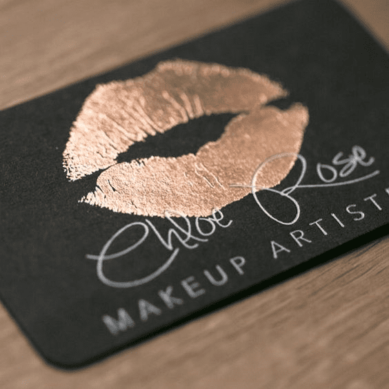
The gold lips provide an obvious allusion to the physical beauty aspect of the job, while a clean black background provides an elegant contrast to the white lettering. Notice also the artful use of contrasting fonts.
(image via zazzle.com)
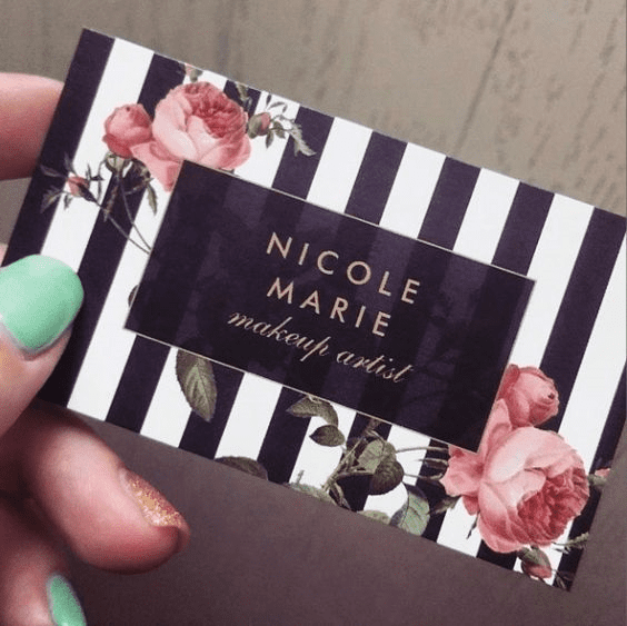
Pinstripes are almost always tasteful, and this card is no exception. The roses add a feminine grace while the clean, vibrant lettering draws the eye to the most important part: the artist’s name.
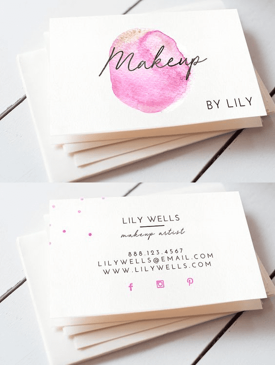
(image via creativemarket.com)
This card is almost the definition of minimal. The front is streamlined to the bone, while the back carries only the most essential contact information. Note the creative use of social media presence, as well as the tasteful dots, which add a hint of color.
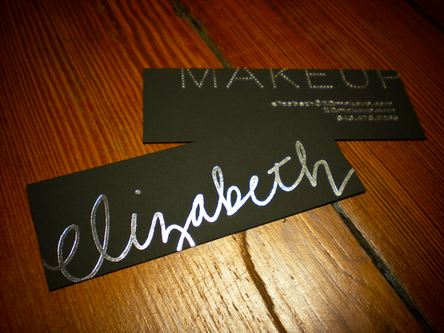
(Image via freshmintcards.com)
The bold, free script of the artist’s name is an ingenuitive way to make it memorable, while the playful backside gives the focal point of the business and contact information.
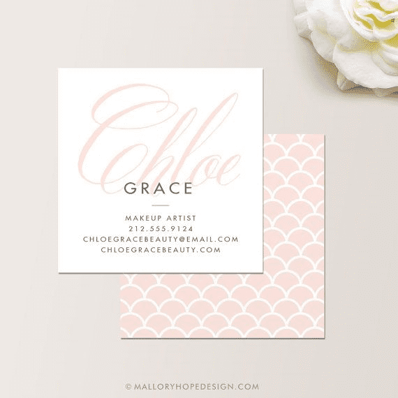
(image via malloryhopedesign.com)
Graceful elegance describes this card. The pastel tones create a feminine, refined atmosphere, while the stately script is the focal point of the front.
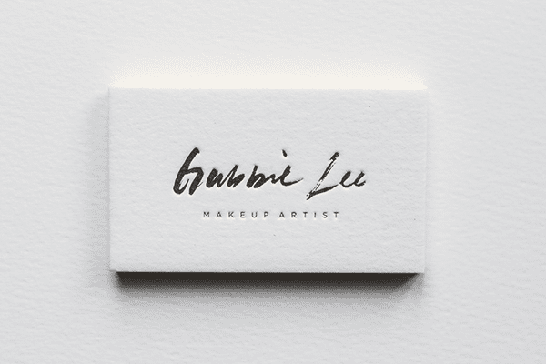
(image via behance.net)
Simplicity and creativity sum up this card. The brushstroke font pairs well with the concept of makeup, while the only other writing on the front gets straight to the point. (Sometimes minimal is best.)
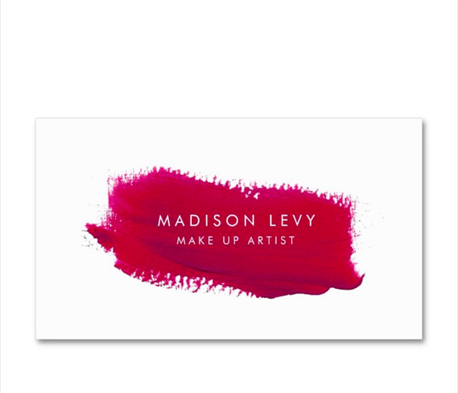
(image via zazzle.com)
The red smear evokes thoughts of blush and lipstick, contrasting nicely with the bone-white background. This also makes use of white lettering, providing a bold central idea that cannot be ignored.
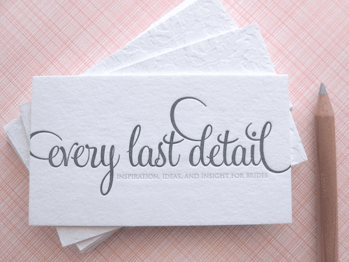
(image via twigandthistle.com)
The whimsy of this card is simply delightful. Originally designed for a bridal consulting business, it could easily be adapted for makeup artistry (the font’s color and style works well with either, and evokes a sense of playfulness, simplicity, and fun).
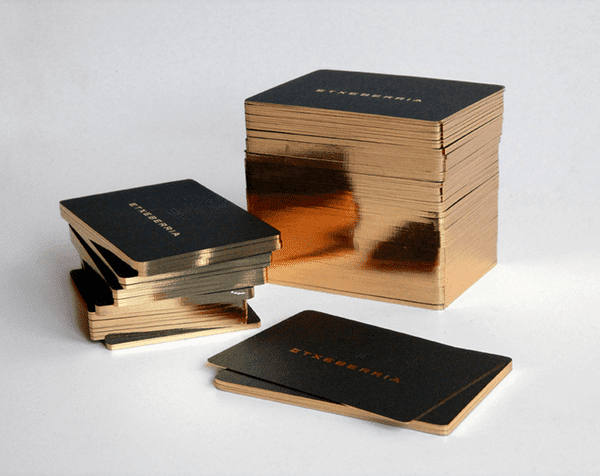
(image via behance.net)
It is never a bad idea to use a tasteful amount of sparkle, and this card does so in a creative way. Rose gold is very popular these days (I see you, iPhone), and it’s quite common for cards to have metallic lettering or accents. But how about a nice gilded edge? This can add a classy and memorable detail that will draw the eye and help you stand out from the crowd.
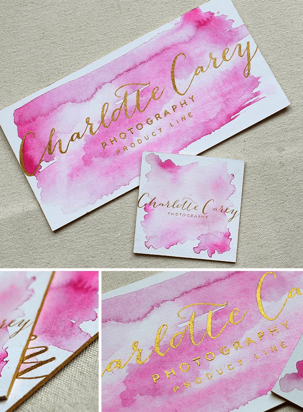
(image via momentaldesigns.com)
A breathtaking use of watercolor is the signifier for this card. Designed for a photography company, it is easily reproducible in the makeup industry. The watercolor’s rose tone creates a feminine aura, while the metallic font conveys professionalism and invitation equally.
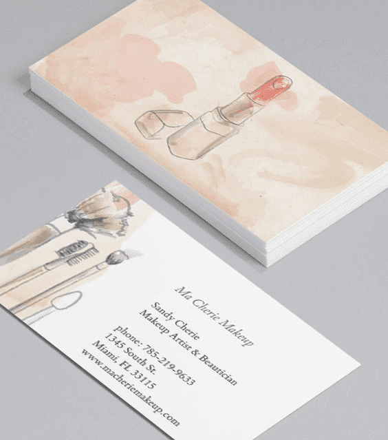
(image via moo.com)
This card is a good example of how simple, lovely imagery can work very well instead of words. Most of the previous cards have had some kind of wording on both front and back. This one has a simple watercolor image on the front, and all of the relevant information on the back. It’s tasteful and direct without being overwhelming or cloying. Moreover, it is distinctive–and that is extremely necessary in any competitive field.
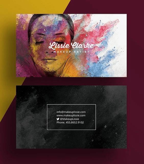
(image via graphicdesignjunction.com)
While too many colors can create an unforgiving sense of busyness and distraction, the right combination can be a delightful success. This card is an excellent example of the latter. The range of color conveys the idea of beauty and creativity, while the female image suggests a waiting canvas on which to paint.
The back is simple and streamlined, with essential contact information only. (Note that this card creatively divided the name of the business and its owner from the rest of the contact information. This draws attention to the name first and makes it memorable.)
Explore High-Quality Makeup Artist Business Card Design Templates
Who knew, in an age when bookstore chains are closing because of the popularity of online sellers and social media platforms multiply by the month, that a well-appointed physical card can be one of the best things you can do for your business? Creativity, simplicity, and directness are all essential for a memorable, effective card.
Creativity, simplicity, and directness are all essential for a memorable, effective card. And with qualified online printers, getting creative business cards shipped straight to your door and into the hands of people is easier than ever.
Banana Print is the premier source for vivid, full-color modern business cards for professionals and creatives. If you’re launching your career as a hair stylist, a makeup artist, a cosmetologist, explore our online selection of business card templates. Pick a template that matches your brand and aesthetic preferences. Customize, and start printing today!
